Analytics > Create chart
On this page, you can create or modify your business analytics chart. To manage your charts, go back to the All Charts tab on the Analytics page.
How to get here
- Sign in to memoQweb as an administrator or a project manager.
-
On the left sidebar, click the Analytics
 icon. The Dashboard tab opens.
 -
In the top right corner, click the Create chart button. If you have no charts created or pinned to your dashboard yet, this button will be also visible in the middle of the page.
OR
-
Click the All Charts tab. memoQ redirects you to the page showing the list of created charts.
-
In the top right corner, click the Create chart button.
-
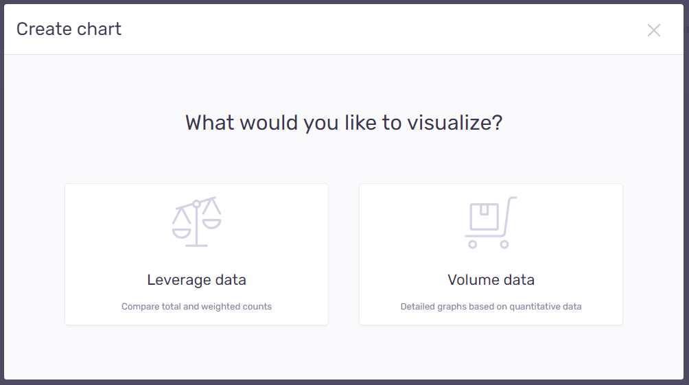
The Create chart window opens:
-
Choose what kind of data you want to visualize:
-
Leverage data – to compare total and weighted counts.
-
Volume data – to create detailed graphs based on quantitative data.
-
memoQ will automatically redirect you to the selected chart creation window.
What can you do?
Decide what you want to visualize and create charts for:
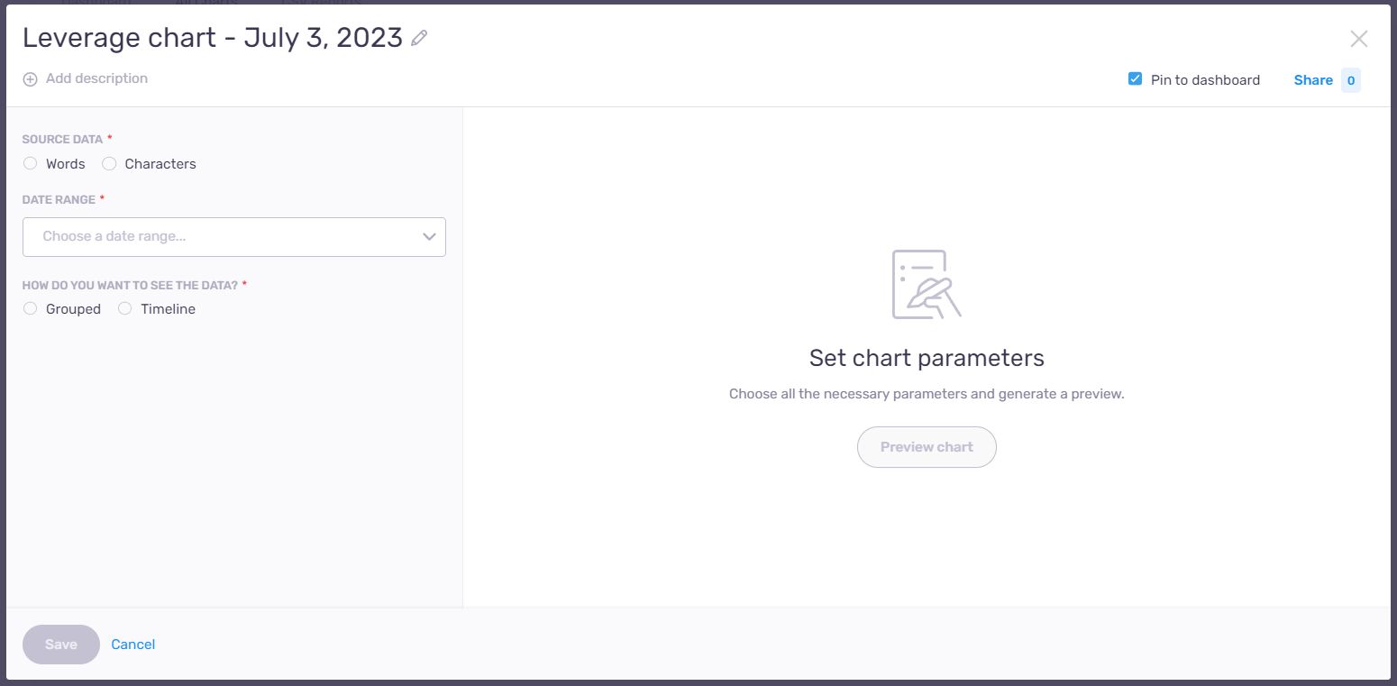
If you want to compare total and weighted counts, the Leverage data option is for you. After you click the Leverage data symbol, memoQ will automatically redirect you to the chart creation window.
Here you can:
- Edit chart’s title – next to the title, click the Edit
 icon. To confirm your changes: Press Enter.
 -
Add description to your chart – under the title, click Add description. To confirm your changes: Press Enter. To modify your description: Click the Edit
icon. -
Pin chart to the dashboard – by default, this checkbox is checked, and all new charts are pinned to the dashboard. If you don’t want to show your new chart on the dashboard, clear this checkbox.
-
Share your chart with others – if you want to send your chart to other users, in the top right corner of the window, click the Share link.
memoQ displays the Who do you want to share with? dropdown:
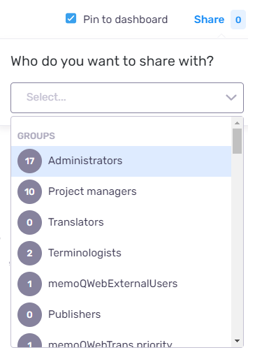
Choose a group or a person you want to share your chart with and click outside the dropdown to save your changes. The numbers visible next to the Share link shows how many people you are sharing your chart with. For example, if a group you selected has 17 members, the number next to the Share link will be 17.
-
Choose your source data – choose between Words and Characters.
-
Choose a date range – click the dropdown and choose a time span for your chart.
Want to use specific dates? Click Custom at the end of the column, and choose a start and an end date from the two date selectors as needed.
-
Decide how you want to show the data – select the radio button depending on how you want to visualize your data:
 Grouped
Under Chart type - choose the chart type that best fits your data and needs. You can choose from Bar chart (Grouped) and Bar chart (Stacked).
Under Grouping - based on what kind of grouping you selected, memoQ displays additional Add groups… dropdown. Choose from the available groups to add this data to the X-axis of your chart.
Under Filtering - specify your criteria and choose an option from the dropdown list to narrow displayed data. Based on what kind of filtering you selected, memoQ displays an additional Add filtersdropdown to choose from.
Timeline
To present your data by its timeline, first choose the correct Segmentation – By quarter or By month.
Under Chart type - choose the chart type that best fits your data. You can choose from Bar chart (Grouped), Bar chart (Stacked), Line graph (Standard), and Line graph (Aggregated).
Under Filtering - specify your criteria and choose an option from the dropdown list to narrow displayed data. Based on what kind of filtering you selected, memoQ displays an additional Add filtersdropdown to choose from.
-
Check how your chart will look - in the middle of the window, click the Preview chart button.
-
View changes you made when editing data - in the middle of the window, click the Refresh preview link.
-
Confirm and save changes - click the Save button.
-
Go back to the All Charts tab without saving changes - click Cancel.
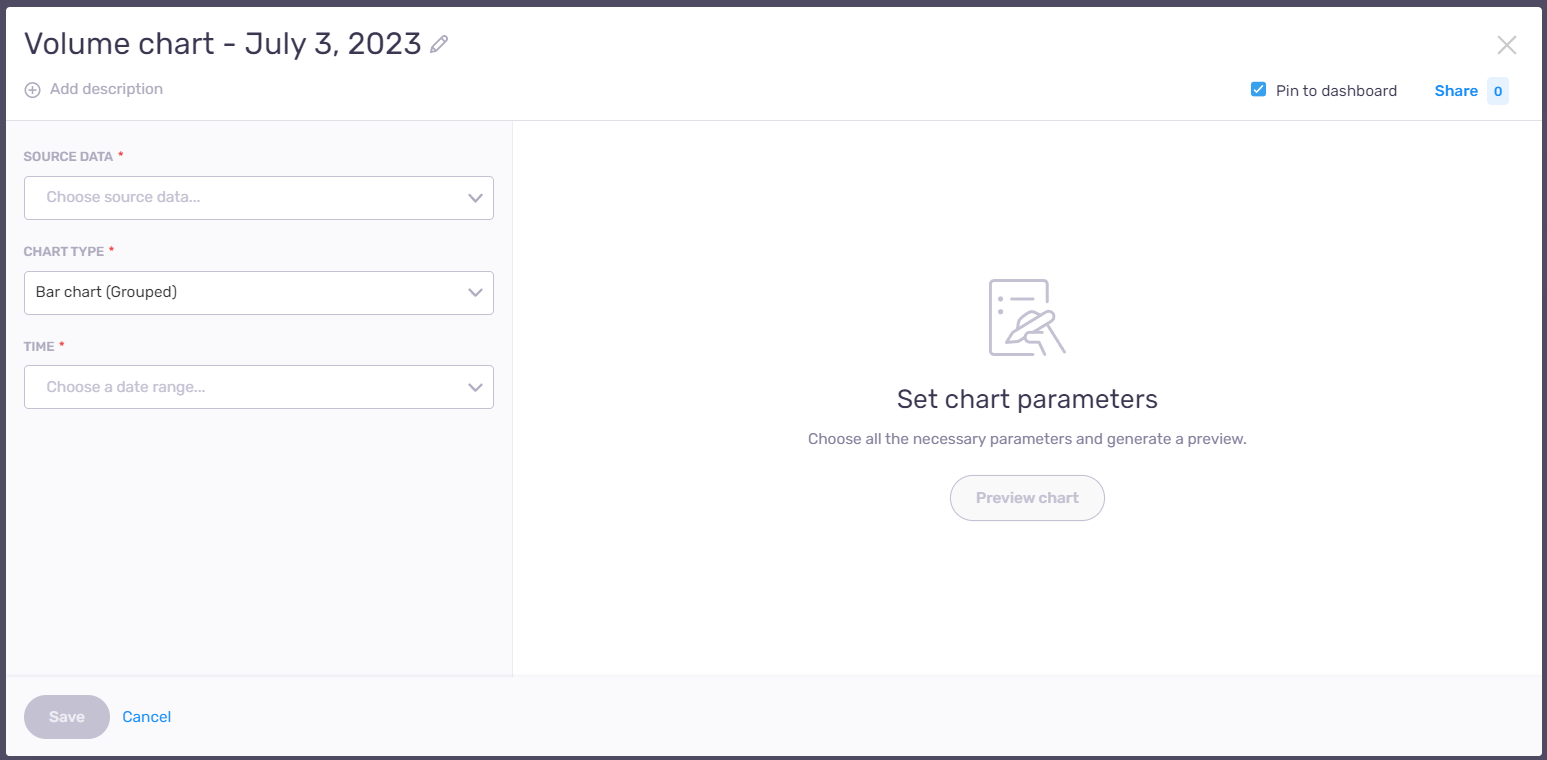
If you want to create detailed graphs on quantitative data, the Volume data option is for you. After you click on the Volume data symbol, memoQ will automatically redirect you to the chart creation window.
Here you can:
- Edit chart’s title – next to the title, click the Edit icon. To confirm your changes: Press Enter.
-
Add description to your chart – under the title, click Add description. To confirm your changes: Press Enter. To modify your description: Click the Edit
icon. -
Pin chart to the dashboard – by default, this checkbox is checked, and all new charts are pinned to the dashboard. If you don’t want to show your new chart on the dashboard, clear this checkbox.
-
Share your chart with others – if you want to send your chart to other users, in the top right corner of the window, click the Share link.
memoQ displays the Who do you want to share with? dropdown:
Choose a group or a person you want to share your chart with and click outside the dropdown to save your changes. The numbers visible next to the Share link shows how many people you are sharing your chart with. For example, if a group you selected has 17 members, the number next to the Share link will be 17.
-
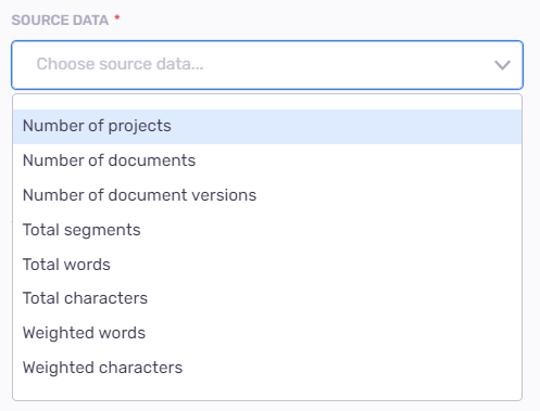
Choose your source data – choose source data from the dropdown list depending on what you want to show in your chart.
-
Choose your chart type – choose the chart type that best fits your data and needs. You can choose from Bar chart (Grouped), Bar chart (Stacked), Line graph (Standard), Pie chart, and Table chart.
-
Choose a date range – under the Time dropdown, choose a time span for your report.
Based on date range you selected, memoQ displays time segmentation radio buttons – By year, By quarter, or By month. Select one that best fits your needs. Make sure to double-check your selection, as the initially selected start and end date can change with this setting.
Want to use specific dates? Click Custom at the end of the column, and choose a start and an end date from the two date selectors as needed.
To confirm: Click outside of the date selector.
-
Under Grouping - based on what kind of grouping you selected, memoQ displays additional Add groups… dropdown. Choose from the available groups to add this data to the X-axis of your chart.
-
Under Filtering - specify your criteria and choose an option from the dropdown list to narrow displayed data. Based on what kind of filtering you selected, memoQ displays an additional Add filtersdropdown to choose from.
-
Check how your chart will look - in the middle of the window, click the Preview chart button.
-
View changes you made when editing data - in the middle of the window, click the Refresh preview link.
-
Confirm and save changes - click the Save button.
-
Go back to the All Charts tab without saving changes - click Cancel.
When you finish
To manage and modify your report: Click the All Charts tab on the Analytics page.
To view all your pinned charts: Click Dashboard tab on the Analytics page.