Dashboard
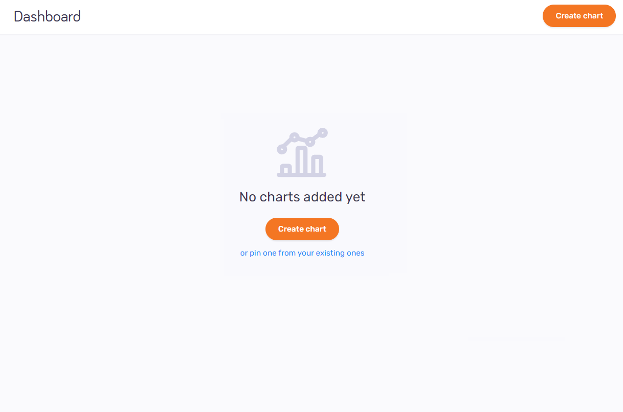
On this page, you can create and pin charts for visualization.
How to get here
- Log in to memoQweb as an administrator or a project manager.
- On the left sidebar, click Analytics.
-
Under Analytics, click Dashboard. The Dashboard page opens.
What can you do?
View and manage the dashboard
-
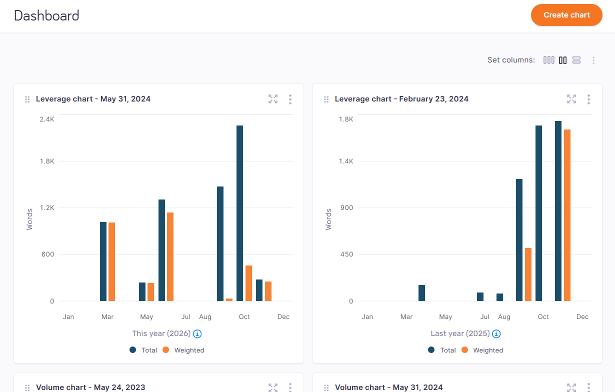
Create a chart - in the top right corner, click the Create chart button. The Create chart window opens. Choose a chart type (leverage or volume) and continue the chart creation process.
-
Decide how you want to see your charts – on the right, above the charts, click one of the options. You can choose from 3-column
 , 2-column
  , and 1-column
  view.
view. -
Expand or collapse all charts - on the right, above the charts, click the More
 icon. From the dropdown, choose Expand all
  or Collapse all
  . Your dashboard will expand all the charts showing all their details or collapse all of them showing only their titles.
 -
Move a chart to another place on the dashboard – to change the position of your chart on the dashboard, click and hold the Ellipsis
 icon. Then move selected chart to another place on the dashboard.
 -
View additional information – click the Information
 icon next to the chart’s title (information added by the chart’s owner) or the date range (information about the country and region covered by the chart).
Expand to a full view – to expand your chart and display it in a full view, click the Full view
 icon. You can check its details or click the Edit button and change its data. To close the full view, click X in the top right corner.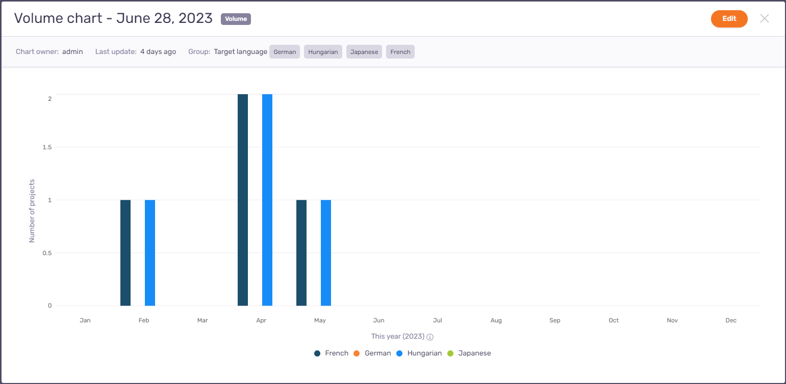
-
Refresh chart – in the top right corner of the selected chart, click the More
icon. To refresh the chart’s data and its look, click Refresh  .
. -
Unpin from dashboard - in the top right corner of the selected chart, click the More
icon, and then click Unpin from dashboard  .
. -
Collapse selected chart - in the top right corner of the selected chart, click the More
icon, and then click Collapse  . The visual part of your chart will collapse and the chart will show only its title.
 -
Duplicate chart - in the top right corner of the selected chart, click the More
icon, and then click Duplicate  . The duplicated chart will be displayed under the original version of the chart, with the word “-Copy” added to its name.
 -
Edit chart – in the top right corner of the selected chart, click the More
icon, then click Edit  .
. -
Delete chart – in the top right corner of the selected chart, click the More
icon, then click Delete  . The Delete chart window opens: To remove the chart from the dashboard, click the Delete chart button. To keep the chart: Click Cancel.
Detect a Business analytics problem
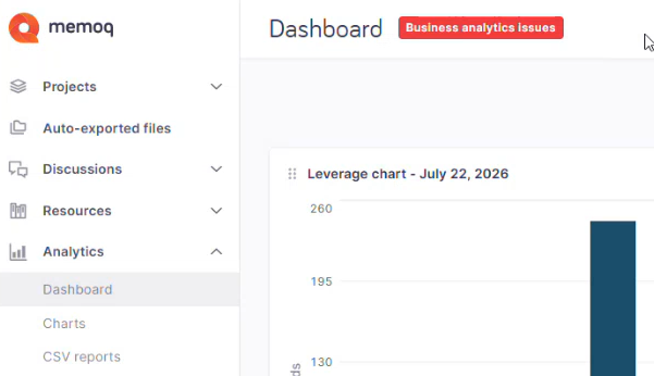
When something goes wrong with Business analytics' background services, a red label appears next to the page's header. For example, on the Dashboard page, it looks like this: